Pages

Sunday, January 8, 2012

Contact Sheets - especially with hand marking

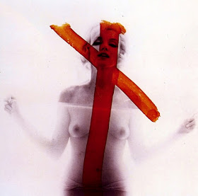
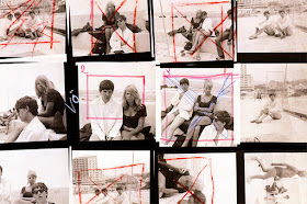
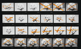
The best-known example of this aesthetic obviously is the series of contact sheets from Marilyn Monroe's final photo session with Bert Stern which have been published and displayed with Marilyn's hand drawn X's through shots she didn't like.


There is something thrilling about seeing a contact sheet even without notations that makes me feel like I am behind the curtain.


Why? I think because the contact sheet is evidence of artistic process and, when marked, lets us in on the post-creation creative deliberative process - and, in the case of Marilyn's markings, collaborative process.  Plus, it invites us to participate in that process - "ah, right, that one is not as good."  


If we thought the red X was an artistic flourish, would it excite as much?


Saturday, January 7, 2012

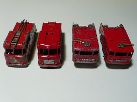
Multiples - Alternate Views - Red

This is not a perfect example of IoA, but it scratches that itch.  I can't rightly say why.  The color is commanding - red does something authoritative.  The form is solid.  It speaks something.  I don't know that it is IoA, but it scratches the itch.


Wednesday, January 4, 2012

WWII Aircraft Recognition Manual - ID Silhouettes

My father was a little kid around the end of WWII.  Seem that kids at that time were encouraged to learn to ID friend and foe aircraft just by silhouette so that they might be better able to recognize an imminent airstrike I suppose.  To that end, they made playing cards with the diagrams and he had some in hi sold stuff.  The cards were based on this government manual.  Anyway, I love the look - always thought one of these would make a great tattoo.  


So, obviously, I loved this album artwork (and the album is fantastic too):


Sunday, January 1, 2012

drug warning labels

First Post: In which I jump right in with an example I got excited about last week and tried to explain to my old lady.  I think I appropriated all these pix from the web.  Boo.